The purpose of this Focus is to introduce our new dedicated Climate Economics research. It is split into three sections. This first looks at how our coverage will be structured and what topics we will focus on. The second introduces our Climate Databank, which is housed in our data and charting portal and is exclusive for CE Advance users. The final section explains our baseline assumptions for carbon dioxide emissions over the coming decades, what these imply for the probable degree of global warming, and how our views relate to the benchmark scenarios produced by the Intergovernmental Panel on Climate Change (IPCC).
In short, we are not pinning our hopes on politics being the driving force of de-carbonisation and do not put much store on the long-term “net zero” commitments made by governments. After all, such goals stretch way out into the future and chime with the fact that many countries in the emerging world are on track to increase emissions this decade.
However, the plunging cost of green technologies and the likelihood of further technological advances mean that firms will be incentivised to embrace green technologies over time, and this will help to reduce emissions ‘organically’. (In other words, we expect de-carbonisation to occur largely despite governments, not because of them.) Although the preferred goal of the Paris Agreement to limit the increase in the global average temperature to 1.5°C of its pre-industrial level is likely to be missed, we are cautiously optimistic that the broader ambition to limit the temperature rise to below 2°C is achievable.
1. Overview of the Climate Economics service
Our new Climate Economics research will provide a top-down view of the impacts that climate change – and the steps taken to mitigate it – will have on macroeconomic performance over the coming decades. This includes examining which countries stand to win and lose from the energy transition, the likely impacts on inflation and public finances, and the broader effects on other variables such as commodities and currencies.
Our Climate Economics research will build upon our macroeconomic expertise and coverage of commodities, and take in areas that do not fit neatly into our existing country and regional coverage. The research will be vital reading for those with long-term investment horizons. It will be an essential guide for anyone struggling to sort the relevant information from the noise of climate-related headlines and to keep track of countries’ progress towards their stated climate targets.
Given the long-term nature of climate change, our climate-related output will mainly be in the form of Update and Focus pieces (as opposed to Rapid and Data Responses, for example). In addition, we will publish a “Climate Watch” report every month, which will be similar in style to the Weekly reports on our country/regional services and focus on recent climate-related developments and flag important events in the month ahead. On average, clients will receive one piece of research per week.
2. Climate Databank and dashboards
A key element of our Climate Economics research is the dedicated Climate Databank, which is housed in our data and charting portal and brings together nearly 9,000 climate-related data series into one place. These series include:
- Data on greenhouse gas emissions over time, by country and by sector, and split between carbon dioxide, methane, and nitrous oxide emissions.
- Long-run series on carbon dioxide emissions split between emissions produced and ‘consumed’ in a given country (thereby highlighting which countries import/export emissions through trade).
- Trends in renewables, including the share of installed electricity capacity in a country that is renewable and the corresponding share of total electricity that this infrastructure generates. The renewables data are broken down by hydro, solar, wind, and geothermal.
- Global data on long-term trends in the cost of renewables, and their utilisation rates.
- Data on the rollout of electric vehicles and the downward trend in battery prices.
- Data on carbon pricing, including the extent to which global emissions are covered by carbon pricing schemes and the variation in carbon prices between jurisdictions.
In addition to the Databank, we also provide a suite of curated dashboards to make sense of the data and to guide you through key climate-related topics. This includes overviews of:
- Countries’ decarbonisation targets.
- Renewables and electric vehicles.
- Greenhouse gas and carbon emissions.
- Carbon pricing schemes.
3. Our climate change assumptions
Forecasting how carbon dioxide emissions will develop over the coming decades is subject to a huge degree of uncertainty and involves considering a range of social, economic, political, and technological developments. Nonetheless, establishing a baseline view on the most likely path for emissions is a necessary step before one can consider how faster or slower progress on the energy transition could affect macroeconomic performance over the coming decades.
Of course, carbon dioxide emissions are not the whole picture when it comes to greenhouse gases, and gases such as methane and nitrous oxide are far more potent in their potential to warm the earth. That said, carbon dioxide emissions have caused most of the warming relative to pre-industrial times and carbon dioxide persists in the atmosphere longer than the other major heat-trapping gases. (For example, whereas methane lasts about 12 years in the atmosphere, carbon dioxide can remain present for thousands of years.) More prosaically, the available time series for carbon emissions are longer than for other greenhouse gases. Accordingly, our focus from a forecasting perspective is on carbon dioxide emissions and, at a global level, it is an acceptable proxy for total greenhouse gas emissions.
3a. The Kaya Identity
We use the Kaya Identity as a framework to guide our thinking on the trajectory of carbon emissions over the coming decades. By way of background, the Kaya Identity is an accounting identity that decomposes carbon emissions into four drivers. It is expressed as follows:
where;
CO2 = Carbon dioxide emissions;
Pop = Population;
GDP/Pop = GDP per capita;
Energy/GDP = Energy intensity (ie, the amount of primary energy consumed per unit of GDP);
CO2/Energy = Carbon intensity (ie, the amount of CO2 emissions per unit of primary energy).
As anyone with a rudimentary grasp of algebra can see, the Kaya Identity simply ‘collapses’ to “CO2 = CO2” if you cross-multiply through by Population, GDP and energy usage. While it is essentially an arithmetic trick, it provides a useful framework to ensure consistency between views on long-term economic trends and the speed at which energy and carbon intensity will fall over time.
Just as we have seen in history, different countries’ population and economies will grow at different paces, and improvements in energy efficiency and de-carbonisation will not be uniform. We are developing country-level forecasts for carbon emissions until 2050 and will discuss the main stories in a dedicated Focus in the near future. However, at a global level, three key points about the drivers of the Kaya Identity are worth making:
First, we expect increases in economic activity over the coming decades – through a combination of population growth and rises in per capita incomes – to continue to put upward pressure on carbon emissions. However, as we have argued before, we do not believe that there has to be a trade-off between preventing global warming and achieving economic growth. (See here.)
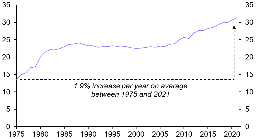
Second, the potential for improvements in energy intensity (ie, the energy consumed per unit of GDP) are more difficult to predict and will vary from country to country. On the one hand, technological progress has reduced the energy intensity of industrial processes over time – as demonstrated by the increase in fuel efficiency in cars in the US (see Chart 1) – and will continue to do so in the future. The fact that renewables entail lower energy losses than fossil fuels when they produce useable energy means that the green transition will reduce the amount of energy that is wasted through so-called transformation losses too.
|
Chart 1: US Car Fuel Efficiency (Miles per Gallon) |
|
|
|
Source: EPA |
That said, many of the gains in energy efficiency in advanced economies in recent decades have coincided with de-industrialisation and compositional shifts in output from manufacturing to services, which is less energy intensive. Indeed, as shown in Chart 2, both the amount of energy per unit of GDP in the UK and the manufacturing sector’s share of output have halved over the past 30 years. It goes without saying that once completed, the process of de-industrialisation cannot be repeated.
|
Chart 2: UK Manufacturing Share & Energy Intensity* |
|
|
|
Sources: OECD, BP, Capital Economics *Exajoules per unit of GDP |
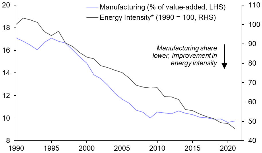
It follows that countries that have already de-industrialised are likely to see slower improvements in energy efficiency in the coming decades than they have in the past.
Third and finally, the multiplicative nature of the Kaya Identity means that the last element – the amount of CO2 emissions per unit of energy, and the only driver that can fall to zero – is pivotal. Indeed, the amounts of economic activity and energy required to power it in the future are in many ways secondary drivers: if all energy becomes carbon-free, the identity would equate to zero.
3b. Assessing the prospects for de-carbonisation
The speed and extent to which countries will de-carbonise will vary, not least because the political willingness to embrace green technologies differs.
As shown in Table 1, most countries in the G20 have committed to achieve “net zero” by either 2050 or 2060.
|
Table 1: G20 Net Zero Ambitions |
|||||||||||||||||||||||||||||||||||||||||||||||||||||||||
|
|||||||||||||||||||||||||||||||||||||||||||||||||||||||||
|
Sources: Climate Action Tracker, Capital Economics |
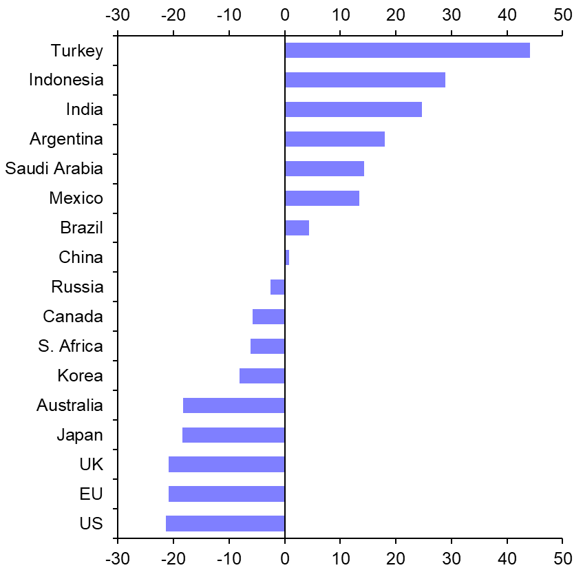
However, there is arguably very little information content in these goals, not least partly because they stretch way out into the future and contrast with the fact that many countries in the emerging world are on track to increase emissions this decade. (See Chart 3.) And as the recent pivot to coal in Europe following the Ukraine war has demonstrated, even ambitious climate ambitions can be forced to take a back seat in the short term when faced with geopolitical realities.
|
Chart 3: Change in Greenhouse Gas Emissions Based on Announced Policies & Actions (%, 2019-2030) |
|
|
|
Sources: Climate Action Tracker, Capital Economics |
The key point is that we are not pinning our hopes on politics being the driving force of de-carbonisation in the coming decades. Admittedly, the incentives and spending commitments in the recently-signed Inflation Reduction Act in the US are a big step in the right direction and could set a precedent for others to follow. However, the incentive for countries to free ride on the efforts of others will remain. More generally, geopolitical fracturing makes any increase in global co-operation to tackle climate change highly unlikely, and any notion of a global carbon price seems destined to stay on the drawing board. In general, there is limited political will to even implement national and regional carbon prices at high-enough levels to drive meaningful reductions in emissions.
In fact, as we argued in our recent Spotlight report, China’s dominance in the supply of some key materials needed for the green transition – particularly cobalt, rare earths, and solar panels – could prove to be a key pinch-point. Fears that fracturing will cause China to restrict the availability of these key commodities to the US and its allies will lead western governments to attempt to invest in developing supplies from aligned countries (so-called “friend-shoring”) and lead to bouts of stockpiling. Against this backdrop, prices of these commodities will probably be higher, and potentially more volatile, than they would have been in a “no fracturing” world, which could increase the cost of the green transition in the near term.
That said, we do not think that fracturing will prove an existential threat to climate efforts in the longer term. Indeed, the greater the extent to which access to resources is curtailed, the faster the push will be to recycle and to innovate.
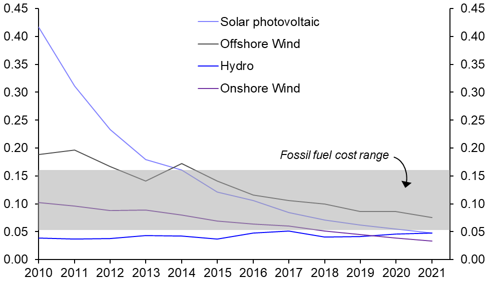
What’s more, given that renewables are already highly competitive relative to fossil fuels as a source of electricity generation, the economic incentives are already in place to de-carbonise. (See Chart 4.) We expect technological progress to make renewables increasingly economic in the future. Of course, the imposition of substantial carbon prices would help to further raise the relative price of fossil fuels and increase the incentive to shift towards renewables. But Chart 3 shows that government-driven carbon price mechanisms are not a necessary condition for the take-up of renewables.
|
Chart 4: Levelised Costs of Electricity Generation[1] (2021 USD per kWh) |
|
|
|
Source: IRENA |
3c. Putting some numbers on it
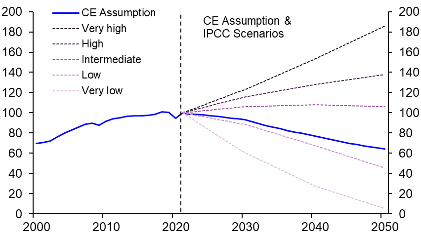
As mentioned above, we are developing country-level forecasts for carbon emissions until 2050 which will be the basis of a bottom-up forecast for global carbon dioxide emissions. At this stage, though, our working baseline assumption is that global carbon dioxide emissions will fall by about 40% between now and 2050. As shown in Chart 5, this puts us between the IPCC’s “low” and “intermediate” carbon emission scenarios. (See Box 1 for background on the bewildering world of the IPCC scenarios.) While this is not consistent with achieving “net zero” by 2050, it would arguably be a pretty good result.
|
Chart 5: CO2 Emissions (2021 = 100) |
|
|
|
Sources: BP, IPCC, Capital Economics |
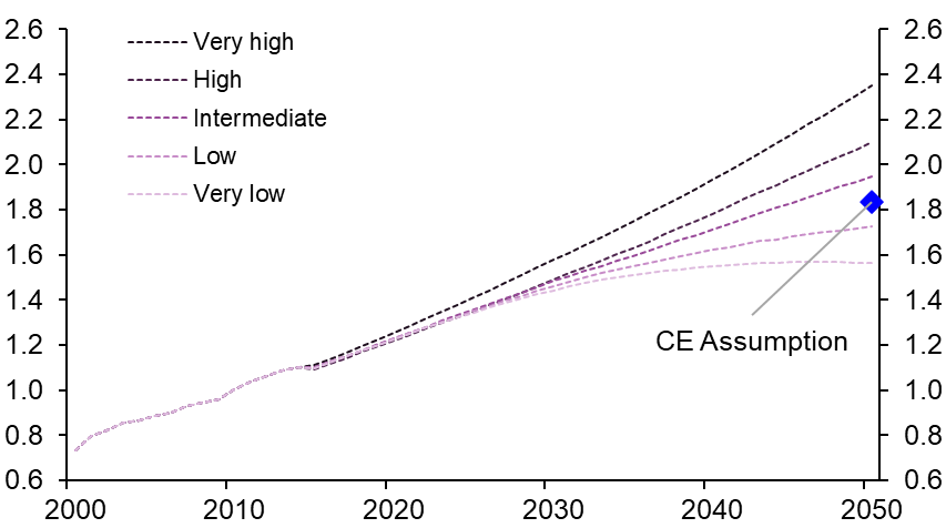
Based on the IPCC modelling (see Table 3 in Box 1), our assumption for carbon dioxide emissions is consistent with the global average surface temperature rising to about 1.8°C above its pre-industrial level by 2050 and broadly stabilising close to this level between 2050 and 2100. (See Chart 6.) This would miss the preferred goal of the Paris Agreement to limit the increase in the global average temperature to 1.5°C, but we are cautiously optimistic that the goal to limit the temperature rise to below 2°C is achievable. (Note that the IPCC’s best estimates of the degree of temperature change under different emissions scenarios are subject to a wide confidence interval.)
|
Chart 6: Global Average Surface Temperature Rise (°C compared to 1850-1900 avg.) |
|
|
|
Sources: IPCC, Capital Economics |
Judging by estimates from the likes of the IMF of the impact of rising temperatures on GDP, this is a small enough increase to mean that global warming will not have a significant impact on GDP growth in most countries within our forecast horizon to 2050 – although more extreme weather events could lead to more volatility in food prices and therefore overall inflation.
Conclusion
We conclude with three key points. First, it must be stressed that there is huge uncertainty about how mitigation efforts and climate outcomes will develop over the coming decades. These will be influenced by a wide range of social, economic, political, and technological developments.
Second, we are sceptical about the extent to which politics will drive the de-carbonisation process, not least because the short-term nature of the political cycle does not lend itself to the long-term nature of the climate challenge. Nonetheless, the plunge in the cost of renewables means that the economic incentives to de-carbonise are already in place. The relative prices of renewables and battery technologies are must-watch series.
Finally, while GDP is the natural go-to variable for considering the economic implications of different climate-related outcomes, it is far from a perfect metric for the purpose. After all, by definition GDP will not capture the damage associated with climate change – such as that following the devasting floods in Pakistan, for example – and reconstruction efforts after such events perversely boost activity. Moreover, focusing too closely on aggregate GDP could obscure economically-significant shifts in the components of output, particularly investment. Indeed, the IMF estimates that climate mitigation efforts could potentially lead to additional investment of about 2% of global GDP between 2030 and 2040 which, as Jean Pisani-Ferry points out, could materially affect the equilibrium real interest rate.
Box 1 – Demystifying the IPCC scenarios
This box demystifies the acronym-laden world of the scenarios produced by the Intergovernmental Panel on Climate Change (IPCC). It starts by examining the various iterations of the scenarios over time before taking a closer look at what the latest versions say about the likely extent of global warming.
Background
The IPCC’s scenarios are a well-used benchmark that describe a range of possible climate outcomes depending on how emissions of greenhouse gases evolve over the coming decades. They are employed for a range of modelling and researching exercises, including by economists such as ourselves, to assess different climate equilibria.
From FAR, IS92 and SRES…
The IPCC started to produce scenarios in its first Assessment Report (FAR), in 1990, which examined how the atmosphere and the climate would respond to changes in emissions under four different emissions pathways (a ‘reference’ business-as-usual case and three alternative, lower emission, scenarios).
These scenarios were updated and expanded two years later and were prosaically titled “IPCC Scenarios, 1992” or “IS92” for short. These were subsequently used in the IPCC’s second Assessment Report (SAR), in 1995, too.
The IS92 work was revamped and broadened as part of the Special Report on Emissions Scenarios (SRES), published in 2000, which was also used as an input into the third and fourth Assessment Reports (TAR and AR4) in 2001 and 2007 respectively.
…to RCPs…
The IPCC changed tack for its fifth Assessment Report (AR5) in 2014, and adopted four Representative Concentration Pathways (RCPs) that superceded the SRES. The four original RCPs were called RCP2.6, RCP4.5, RCP6, and RCP8.5; three new scenarios have since been added: RCP1.9, RCP3.4, and RCP7. Note that the RCPs differ from previous IPCC scenarios by focusing on the concentrations of greenhouse gases (GHG) in the atmosphere rather than GHG emissions per se – hence the word “concentration” in their name.
The labelling of the RCPs is one for the purists and needs some explanation: the numbers that succeed “RCP” are the predicted changes in “radiative forcing values” by 2100 in each scenario. (These are measured in watts per square metre of the earth’s atmosphere; on average, the earth receives about 340 W/m2 from the sun per year.) In short, an increase in radiative forcing means that the earth will receive more incoming energy from the sun than it reflects back into space, and this net gain of energy will cause warming. Generally speaking, the lower the number of the RCP scenario, the lower the degree of global warming it is consistent with.
…and SSPs
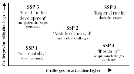
The scenarios in the sixth Assessment Report (AR6) build upon the RCP framework but put more focus on the ways in which socio-economic factors, such as population and technological trends, will affect future emissions and warming outcomes. Specifically, the latest IPCC scenarios use the five qualitative Shared Socio-economic Pathways (SSPs) that were first published in the academic community in 2016. (Note that the IPCC’s three Working Groups have already published their contributions to AR6, but the Synthesis Report is not scheduled to be released until late 2022 or early 2023.)
A full description of the narratives that underpin the five SSPs can be found here but Table 2 and Chart 7 give an overview of how they fit together. SSP2 is the “Middle of the Road” case, in which social, economic, and technological trends do not shift markedly from historical patterns; SSP1 is the “green” way, whereas SSP3 is the most challenging backdrop from a socio-economic perspective.
|
Table 2: SSP Narratives |
||||||||||||
|
||||||||||||
|
Chart 7: Shared-Socio-Economic Pathways Taxonomy |
|
|
|
Source: O’Neill et al (link) |
The SSPs are designed to be complementary to the RCP pathways to show how different levels of climate change mitigation could play out alongside different societal and technological backdrops.
It follows that the five scenarios that are highlighted in the IPCC’s sixth Assessment Report are labelled SSP1-1.9, SSP1-2.6, SSP2-4.5, SSP3-7.0, SSP5-8.5, where the number after ‘SSP’ but before the hyphen refers to the SSP narrative that underpins that scenario, and the number after the hyphen relates to the same “radiative forcing values” as in the RCPs. (All clear?!)
Luckily, somebody in the IPCC’s communications department evidently felt it would be useful to translate these scenario names into the language of a layperson by describing the degree of greenhouse gas emissions in each case, from very low, low, intermediate, high, to very high. For clarity’s sake, this is the convention that we prefer and use.
Table 3 shows the IPCC’s best estimates of the changes in the average global surface temperature relative to pre-industrial times under each scenario, as well as the wider range around this best estimate that it considers “very likely”. As can be seen, the very low scenario (SSP1-1.9) is the only one in which the IPCC’s best estimate of global warming is consistent with meeting the preferred Paris goal of limiting the degree of warming to 1.5°C relative to pre-industrial times.
|
Table 3: Overview of the Five Illustrative IPCC AR6 Scenarios |
|||||||||||||||||||||||||||||||||
|
|||||||||||||||||||||||||||||||||
|
Source: IPCC *Relative to 1850-1900 average |
|||||||||||||||||||||||||||||||||
David Oxley, Head of Climate Economics, david.oxley@capitaleconomics.com
[1] Note that the Levelised Cost of Electricity (LCOE) of a given technology is the ratio of lifetime costs to lifetime electricity generation, discounted back to a common year using a discount rate that reflects the average cost of capital. Note that the LCOE calculations exclude the impact of any financial support, and all project data refer to the year in which the project was commissioned.